
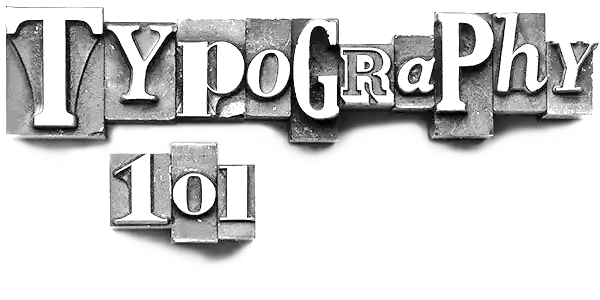
What is typography? ...and How Fonts Shape Your Design
Typography isn’t just about letters on a page —it’s the silent art that defines how people perceive your brand, your story, and even your personality. I celebrate creativity and craftsmanship, the right font can transform your designs from ordinary to extraordinary. Here’s your ultimate guide to understanding fonts and how they impact your visual identity. The art and technique of arranging letters and text to make content legible, clear, and visually engaging. It encompasses font style, structure, and appearance, all meticulously designed to evoke emotions and convey specific messages. In essence, typography transforms plain text into an expressive and impactful visual element.
The origins of typography date back to the 11th century with the invention of movable type. Before the digital era, typography was a highly specialized craft, primarily associated with books, magazines, and public works. A pivotal moment in typographic history came with the creation of the Gutenberg Bible, a masterpiece that revolutionized typography in the Western world. Typography continues to evolve, yet its core purpose remains the same: to bring words to life in a way that resonates with readers. Articles
Why is it so vital?
Typography sets the tone for your message. Think of it as the voice of your design. A romantic handwritten script tells a different story than a bold, modern sans-serif font. Whether you’re designing for a cozy boutique, a playful kids' brand, or a luxurious event, the font you choose becomes a part of your narrative.
Difference between Fonts and typefaces:
The terms ‘fonts’ and ‘typefaces’ are often used interchangeably, although there are subtle differences between the two. Put simply, typeface refers to an entire family of fonts, which can be different weights. However, fonts refer to the individual weights, styles and widths that make up each typeface family when applied to lowercase letters, capital letters and numerals.
10 Key Typography Terms
|
|
How to Choose the Perfect Font
- Define Your Brand Personality: Are you elegant and timeless or playful and modern? Your font should reflect your brand’s character.
- Consider Readability: Choose fonts that are legible, especially for body text.
- Match the Medium: Serif fonts shine in print, while sans-serif dominates on screens.
- Pair Fonts Thoughtfully: Combine a primary font for headings with a complementary font for body text.
Typography is more than choosing a pretty font; it’s about crafting an experience. I believe every design tells a story—and with the right typography, yours will resonate beautifully. Happy designing!